OPTIFY™ Solutions Newsletter
Volume 4 | November 11, 2025
Four key factors to getting the most out of your OPTIFY™ Gateway signal
Table of Contents
To get the best performance from your gateway and sensors, placement is key. Here are a few key factors to keep in mind when setting up your system.
1. Line of sight
The single most important factor is line of sight. Your gateway communicates best when it has a clear, unobstructed path to the sensors. Walls, machinery, and other obstacles can significantly weaken the signal. Whenever possible, aim for a direct “line of sight” between the gateway and your sensors.
2. Distance
The farther a sensor is from the gateway, the weaker the signal becomes. While you can’t easily move your motors or bearings, you can adjust where you install your gateway. Position your gateway so it can reach the largest number of sensors at once.
3. Gray area
Every gateway has one natural, less-optimal zone, also known as a “gray area”, and that is directly underneath the gateway. For best results, orient the gateway so its “front” faces the area with the highest concentration of sensors. Avoid placing sensors directly behind or underneath the gateway, where the signal is hardest to reach.
4. Height
Generally, the gateway should be installed higher than the sensors, not lower. A higher vantage point reduces obstructions and helps the gateway reach more sensors with a stronger signal.
Before finalizing installation, test the gateway’s performance in a few different spots. Even small changes in placement can make a big difference in coverage and reliability.
OPTIFY applied
Real-time OPTIFY data prevents costly drive package damage
Outdoor aggregate facilities present some of the harshest environments for mounted bearings, enclosed gearing, and power transmission components. Extreme temperatures, moisture, and contaminants place extraordinary stress on equipment.
Recently, an OPTIFY-enabled primary conveyor system demonstrated the value of real-time monitoring. A producer detected an immediate vibration spike across the drive components on the right side of a large dual-drive conveyor. The main drive platform features dual 250-horsepower motors and MagnaGear XTR® 700 gearboxes delivering torque to a drive pulley supported by SAF-XT 23056 10-inch pillow block bearings.
Severe weather had significantly stressed the power connectors on the right-side motor of the drive platform.
OPTIFY Performance Sensors registered extreme vibration changes across the drive platform’s asset group. The motor sensor, gearing sensor, and bearing sensor all registered nearly double or more their normal operating vibration levels and immediately communicated this information via push notifications and emails to registered users within the organization, including the plant manager.
The descending progression of vibration increase quickly identified the problematic asset in the powertrain. Motor vibration had increased five times above normal, three times for the MagnaGear XTR unit, and two times for the SAF-XT drive pulley bearing.
This easily accessible information enabled the plant manager to quickly shut off motor power and begin inspection. A damaged input lead was discovered and repaired, and the conveyor was down for less than half a day. Without performance sensors and OPTIFY platform notifications, the severe vibration from the incorrectly powered motor could have severely damaged the motor, the gearbox, or both.
The repair would have taken days rather than hours, and the replacement and lost production costs would have been significant. The plant manager, relieved to avoid a major downtime event and stated, “It wasn’t the motor or gearbox; bad wiring caused the motor to single-phase. The sensors nailed it. That was impressive, and it never crossed my mind that we would have the capability of identifying these types of issues.”
Helpful tips and tricks
Asset creation in the OPTIFY platform
When using OPTIFY, precise asset creation is essential for success on the platform. Many pieces of information entered during asset creation are used elsewhere in the platform, particularly in fast Fourier transforms (also known as FFTs).
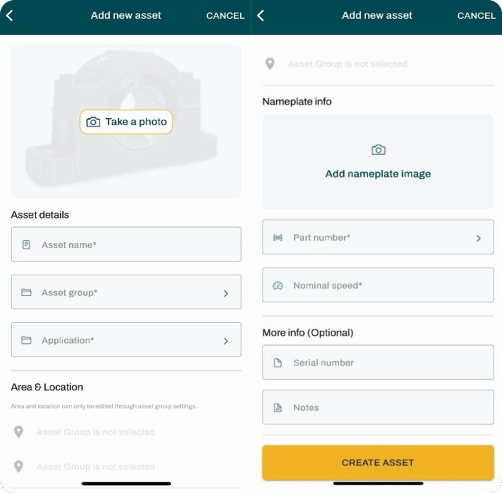
When you create a new asset in the OPTIFY platform, the first thing you’ll see is an option to upload a photo. Adding an image isn’t required, but it’s highly recommended because it makes future identification and reference much easier.
Next, you’ll enter the asset name. This is the name that will appear on the platform, so it’s important to ensure it clearly represents the equipment. Include identifying numbers or location details if needed, especially if you’re commissioning multiple sensors on similar equipment.
After completing the application assignment, you will be prompted to choose “Yes” or “No” if the application is for a hazardous location.
Then, you’ll select an asset group. Every plant starts with a “Default” group, but if you have multiple assets, it’s often helpful to create groups based on specific criteria. In plants with intermediate or advanced structures, asset groups are tied to areas for intermediate structures or to both locations and areas for advanced structures.
Next, you’ll fill in the application field. The preset options include air handling, belt conveyor, bucket elevator, mixer, palletizer, trunnion wheel, or unit handling conveyor. If none of these fit your equipment, you can select “Create new application.”
If your plant uses an intermediate or advanced structure, the area and location fields will populate automatically based on the asset group you selected earlier.
The next field is for a nameplate image. This is optional but highly recommended for the same reason as adding an asset image, as it makes identification easier later.
If you’re using the sensor with a Dodge gearbox or bearing, make sure you enter the correct part number. The platform uses this information when analyzing FFTs to identify specific fault frequencies for bearings and gear mesh frequencies for Dodge gearboxes. Note, this feature is only available for Dodge components.
After the part number, enter the nominal speed of the asset. This is required because FFT analysis uses the running speed to interpret vibration data accurately.
The last two fields, serial number and notes, are optional. Use them to store the asset’s serial number or add any remarks you want to keep for future reference.
What's new in the OPTIFY platform?
With the new advanced asset analytics within the OPTIFY platform, you can now monitor the uptime of your plant alongside the health of your assets. This allows you to visualize how often every asset in the plant is running.
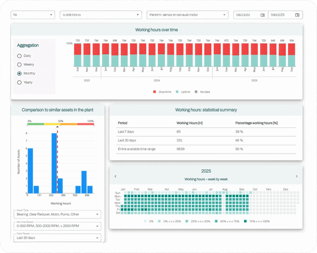
Visualizing working hours
OPTIFY now offers multiple ways to visualize your asset’s working hours. In the “Working hours over time” tile, you can see uptime versus downtime for a specific asset over any time period you choose.
Beyond selecting the time range, there are four ways to customize this graph:
- Analysis setting: choose to display uptime data, downtime data, no data, or all data; this changes the visualization only, not the underlying data
- Downtime threshold: adjust what counts as downtime using the “Velocity RMS Downtime Threshold” setting
- Sensor selection: pick which sensor’s data to use for the graph
- Date range: focus on larger, smaller, or specific time periods by changing the date range
These options make it easy to tailor your view to your needs and get a clearer picture of asset performance.
Viewing data trends
The “Working hours – week by week” graph gives you a calendar-style view of asset usage. This makes it easy to spot long-term trends and identify anomalies by reviewing day-by-day data over several months.
For a deeper look, check the “Working hours: statistical summary” section. This breaks down total working hours for the last 7 days, the last 30 days, and the entire asset life. You’ll see both total hours and the percentage of time the asset was running compared to the total hours in each period.
Comparing working hours
Want to see how your assets stack up? Use the “Comparison to similar assets in the plant” tile to compare performance across your equipment. You can customize the comparison by filtering for similar asset types, similar speed ranges, and a specific date range.
Just like in the “Working hours over time” view, you can adjust the velocity RMS downtime threshold to better define downtime for your plant. This lets you see not only how much uptime this asset has compared to others, but also how active your plant is overall.
How to access the tool
The tool can be accessed in two different ways:
- Through the “Plant” tab
- Navigate to the plant tab so that you can view all the assets within your plant
- Find the asset you would like to investigate and click the “Details” button on the far-right side of the screen
- Select “Downtimes and Working Hours” to access this tool
- Through the “Data” tab
- Navigate to the data tab
- Find the asset you would like to view and click the three dots next to it
- Select “Advanced Asset Analytics,” and you will be directed to the tool
_Event _5 Plug – Copy")